Chapter 15 HR Service Desk
How to use metrics:
- Inform your stakeholders
- Report measurements so that stakeholders can understand activities and results
- Promote the value of the organization
- Determine the best way to communicate the information to the stakeholders
- Perform better stakeholder analysis to facilitate stakeholder buy-in
- Improve performance - people do what is measured
Four types of process metrics:
- Monitor progress by checking in process maturity
- Monitor efficiency by checking use of resources
- Monitor effectiveness by checking how many correct and complete first time
- Monitor compliance in relation to process and regulatory requirements
Factors to consider when reporting:
- Who are the stakeholders?
- How does what you are reporting impact the stakeholders?
- Reports must be easy to read and understood, thus they need to be developed with the stakeholder in mind.
- Reports need to show how the support center is contributing to the goals of each stakeholder and the business.
- Reports must identify the appropriate channels to communicate with each of the stakeholders.
Source: https://www.kaggle.com/lyndonsundmark/service-request-analysis/data
Ensure all needed libraries are installed
library(tidyverse)
library(lubridate)
First, let’s get some data from our service desk by exporting a CSV. We can then read this CSV (or excel spreadsheet) into R for us to perform analysis.
service_requests <- read_csv("https:///hranalytics.netlify.com/data/ServiceRequestExtract2.csv")Note that we can solve some things as we load the data using read_csv() like the column data types and handling different ways people can represent missing or unknown data.
We then need to get this data analysis-ready. First of all, we need to make sure dates are filled in and/or reasonable.
service_requests %>%
  mutate(DateStarted = coalesce(DateStarted, DateSubmitted),
         DateCompleted=coalesce(DateCompleted, DateStarted + hours(2))) %>%
  mutate(DateCompleted =
           pmin(DateCompleted,
              DateStarted + hours(floor(rnorm(n(), mean = 71, sd=20))))) ->
  service_requests
Then we can work out how long it took to complete different stages of a request.
service_requests %>%
  mutate(RequestID = as.character(RequestID)) %>%
  mutate(
    WaitTime = difftime(DateStarted,
                        DateSubmitted,
                        units = "hours")
    ,TaskTime = difftime(DateCompleted,
                        DateStarted,
                        units = "hours")
    ,TotalTime = difftime(DateCompleted,
                        DateSubmitted,
                        units = "hours")) %>%
  mutate_at(vars(ends_with("Time")), as.numeric)->
  service_requests

service_requests
# A tibble: 1,152 x 8
RequestID DateSubmitted DateStarted DateCompleted
<chr> <dttm> <dttm> <dttm>
1 1 2014-11-26 13:43:00 2014-12-13 06:02:00 2014-12-13 06:02:00
2 2 2014-11-29 14:41:00 2014-12-20 06:47:00 2014-12-22 03:47:00
3 3 2014-11-29 14:43:00 2014-12-24 08:06:00 2014-12-27 18:06:00
4 4 2014-11-29 14:45:00 2015-02-09 03:31:00 2015-02-11 09:31:00
5 5 2014-11-29 14:49:00 2014-12-06 06:43:00 2014-12-06 06:43:00
6 6 2014-11-29 14:50:00 2014-12-21 06:00:00 2014-12-21 09:00:00
7 7 2014-11-29 14:50:00 2015-01-07 00:55:00 2015-01-09 23:55:00
8 8 2014-12-01 08:38:00 2015-01-14 03:29:00 2015-01-15 08:29:00
9 9 2014-12-03 16:26:00 2014-12-07 01:12:00 2014-12-08 17:12:00
10 10 2014-12-07 11:41:00 2014-12-16 00:25:00 2014-12-16 00:25:00
# ... with 1,142 more rows, and 4 more variables: Category <chr>,
# WaitTime <dbl>, TaskTime <dbl>, TotalTime <dbl>We should now be able to get a view as to the distribution of the times taken to start, complete, and the overall turnaround time for requests.
library(DataExplorer)
plot_density(service_requests,
             title = "Distribution of task times",
             ggtheme = theme_minimal())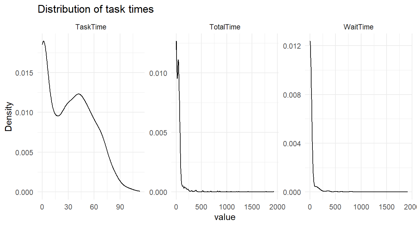
plot_bar(service_requests,
         title="Distributions",
         ggtheme = theme_minimal())
4 columns ignored with more than 50 categories.
RequestID: 1152 categories
DateSubmitted: 1135 categories
DateStarted: 1132 categories
DateCompleted: 1146 categories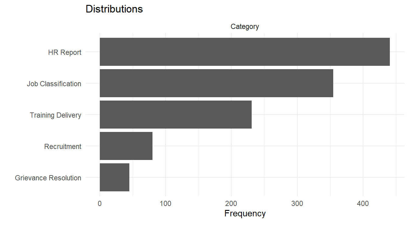
service_requests %>%
  group_by(Category) %>%
  summarise_at(vars(ends_with("Time")),
              .funs = c("mean","min","max")) %>%
  arrange(WaitTime_mean)
# A tibble: 5 x 10
Category WaitTime_mean TaskTime_mean TotalTime_mean WaitTime_min TaskTime_min
<chr> <dbl> <dbl> <dbl> <dbl> <dbl>
1 Grievan~ 11.8252 71.1333 82.9585 0 24
2 HR Repo~ 23.8362 4.76644 28.6026 0 0
3 Trainin~ 26.1803 58.8442 85.0245 0 20
4 Recruit~ 28.89 67.2125 96.1025 0 23
5 Job Cla~ 33.3248 35.1070 68.4318 0 11
# ... with 4 more variables: TotalTime_min <dbl>, WaitTime_max <dbl>,
# TaskTime_max <dbl>, TotalTime_max <dbl>Now that we’ve checked our data for issues and tidied it up, we can start understanding what’s happening in-depth.
For instance, are the differences in category mean times significant or could it be due to the different volumes of requests? We can use the ANOVA test to check to see if each category does indeed seem to have differing response times. If the resulting P-value is small then we have more certainty that there is likely to be a difference by request category.
library(RcmdrMisc)
lm(WaitTime ~ Category, data=service_requests) %>%
  Anova()
Anova Table (Type II tests)
Response: WaitTime
Sum Sq Df F value Pr(>F)
Category 29404 4 0.42 0.79
Residuals 19942945 1147 lm(TaskTime ~ Category, data=service_requests) %>%
Anova()Anova Table (Type II tests)
Response: TaskTime
Sum Sq Df F value Pr(>F)
Category 665056 4 1742 <0.0000000000000002 ***
Residuals 109458 1147
---
Signif. codes: 0 '***' 0.001 '**' 0.01 '*' 0.05 '.' 0.1 ' ' 1lm(TotalTime ~ Category, data=service_requests) %>%
Anova()Anova Table (Type II tests)
Response: TotalTime
Sum Sq Df F value Pr(>F)
Category 731473 4 10.5 0.000000025 ***
Residuals 20035691 1147
---
Signif. codes: 0 '***' 0.001 '**' 0.01 '*' 0.05 '.' 0.1 ' ' 1As well as statistical tests, we can apply quality control principles too. The qcc package allows us to use a number of relevant models and charts to understand what is happening.
Here we use the package to take a number of samples from the data and prepare a qcc base transformation containing information needed to make common charts. We use the xbar.one transformation to get the mean using one-at-time data of a continuous process variable.
library(qcc)

service_requests %>%
  {qcc.groups(.$WaitTime, .$RequestID)} %>%
  qcc(type="xbar.one") %>%
  summary()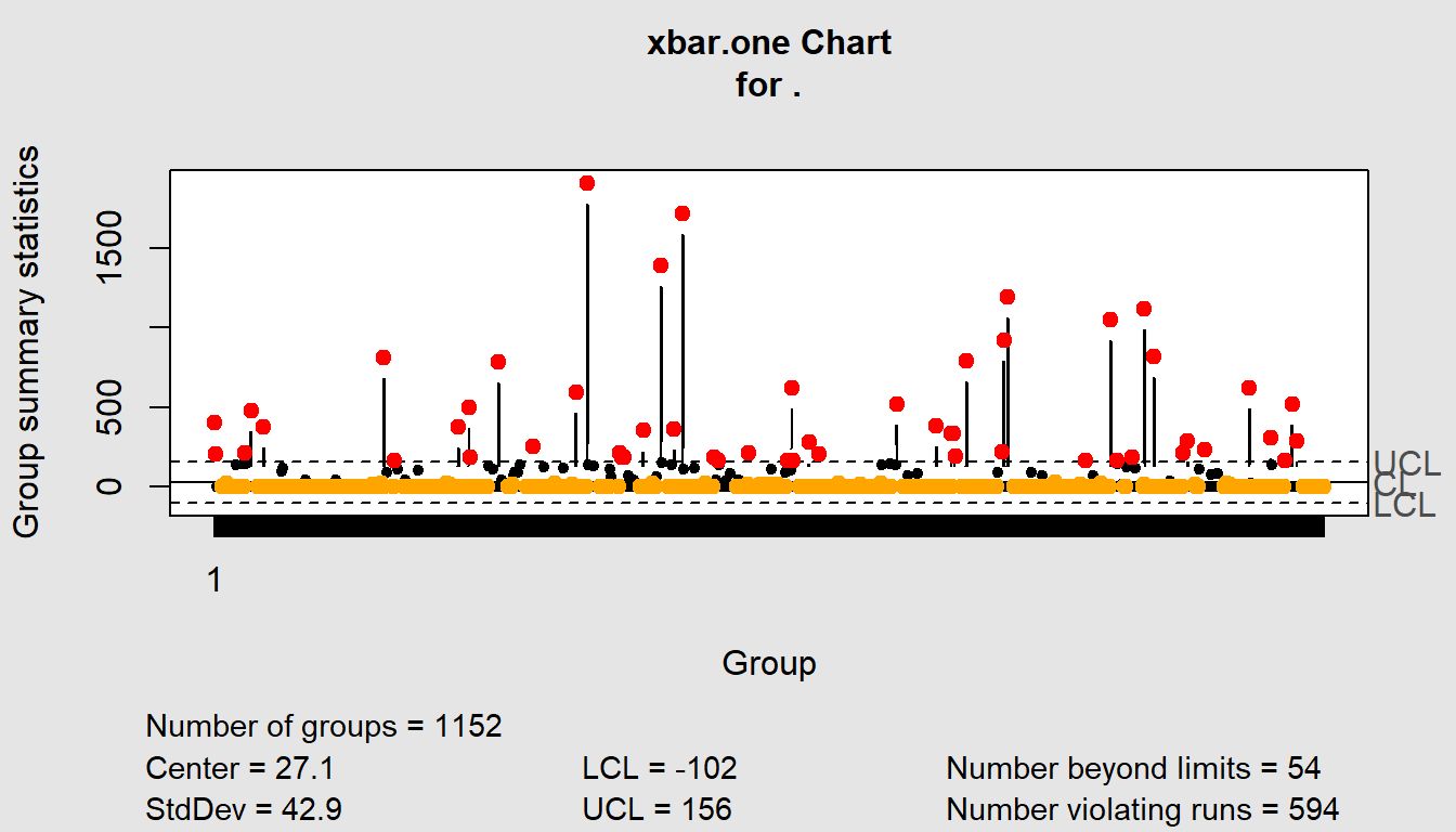
Call:
qcc(data = ., type = "xbar.one")

xbar.one chart for .

Summary of group statistics:
   Min. 1st Qu.  Median    Mean 3rd Qu.    Max.
      0       0       0      27       0    1910

Group sample size:  1152
Number of groups:  1152
Center of group statistics:  27.1
Standard deviation:  42.9

Control limits:
  LCL UCL
 -102 156
service_requests %>%
{qcc.groups(.$TaskTime, .$RequestID)} %>%
qcc(type="xbar.one") %>%
summary()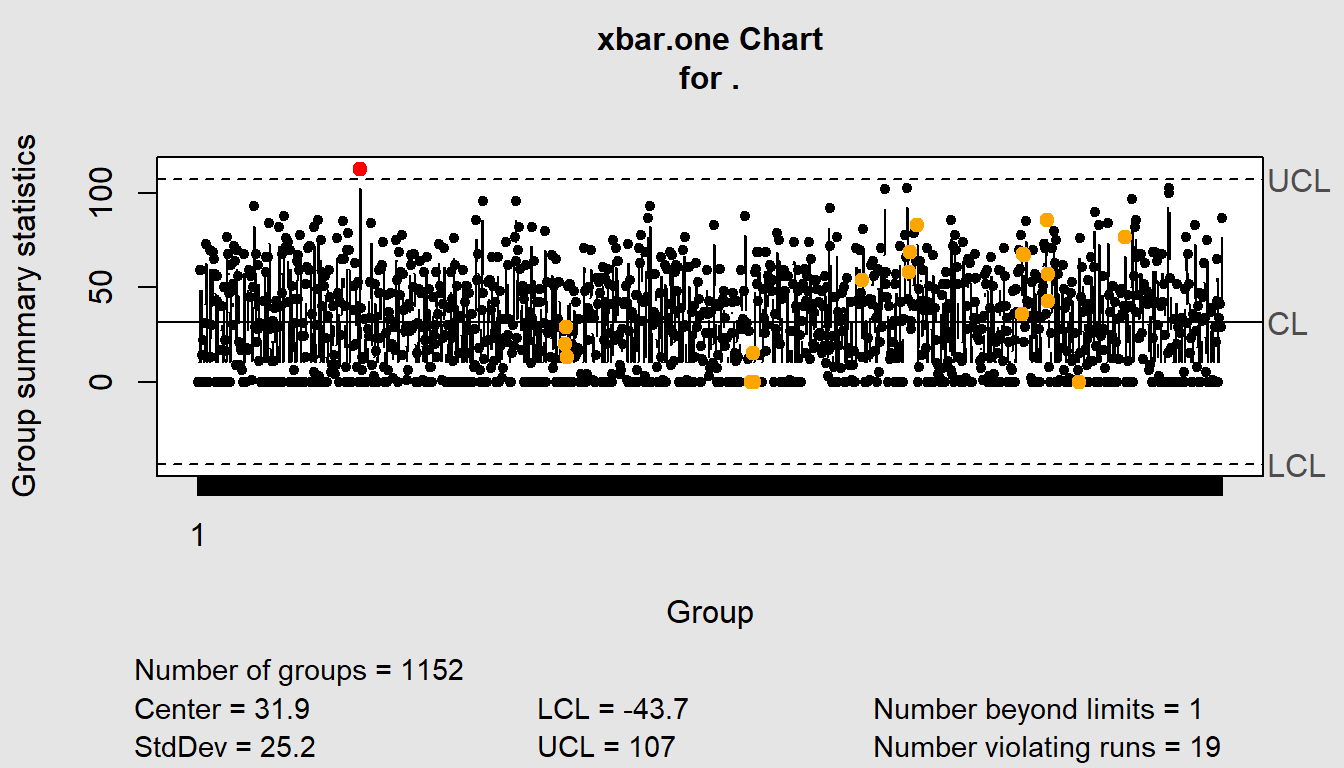
Call:
qcc(data = ., type = "xbar.one")

xbar.one chart for .

Summary of group statistics:
   Min. 1st Qu.  Median    Mean 3rd Qu.    Max.
    0.0     6.0    30.0    31.9    52.0   113.0

Group sample size:  1152
Number of groups:  1152
Center of group statistics:  31.9
Standard deviation:  25.2

Control limits:
   LCL UCL
 -43.7 107
service_requests %>%
{qcc.groups(.$TotalTime, .$RequestID)} %>%
qcc(type="xbar.one") %>%
summary()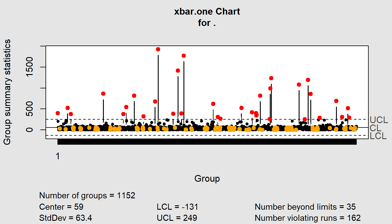
Call:
qcc(data = ., type = "xbar.one")

xbar.one chart for .

Summary of group statistics:
   Min. 1st Qu.  Median    Mean 3rd Qu.    Max.
      0      11      37      59      60    1926

Group sample size:  1152
Number of groups:  1152
Center of group statistics:  59
Standard deviation:  63.4

Control limits:
  LCL UCL
 -131 249
These show overall patterns. What if we wanted one per category?
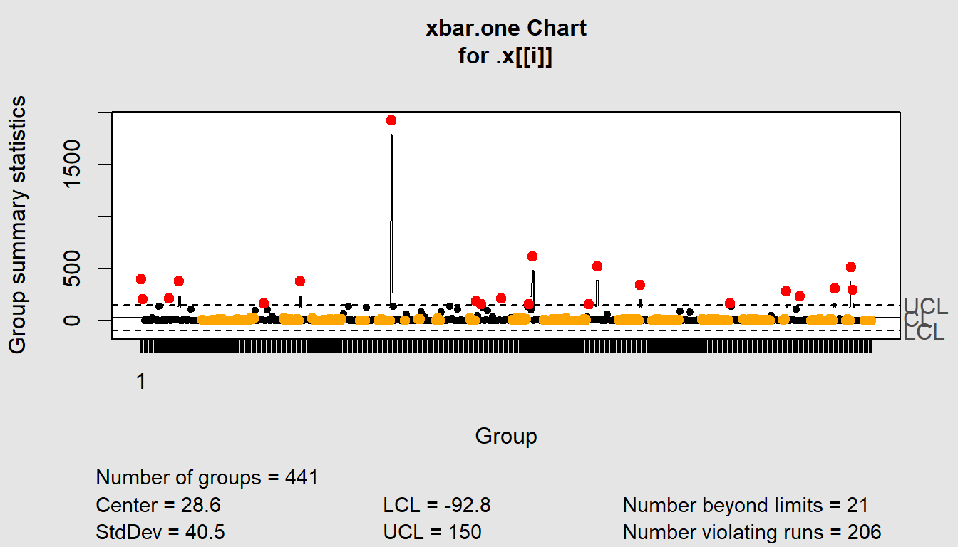
# Need to get categories being added as titles
service_requests %>%
  {split(., .$Category)} %>%
  map(~qcc.groups(.$TotalTime, .$RequestID)) %>%
  map(qcc, type ="xbar.one")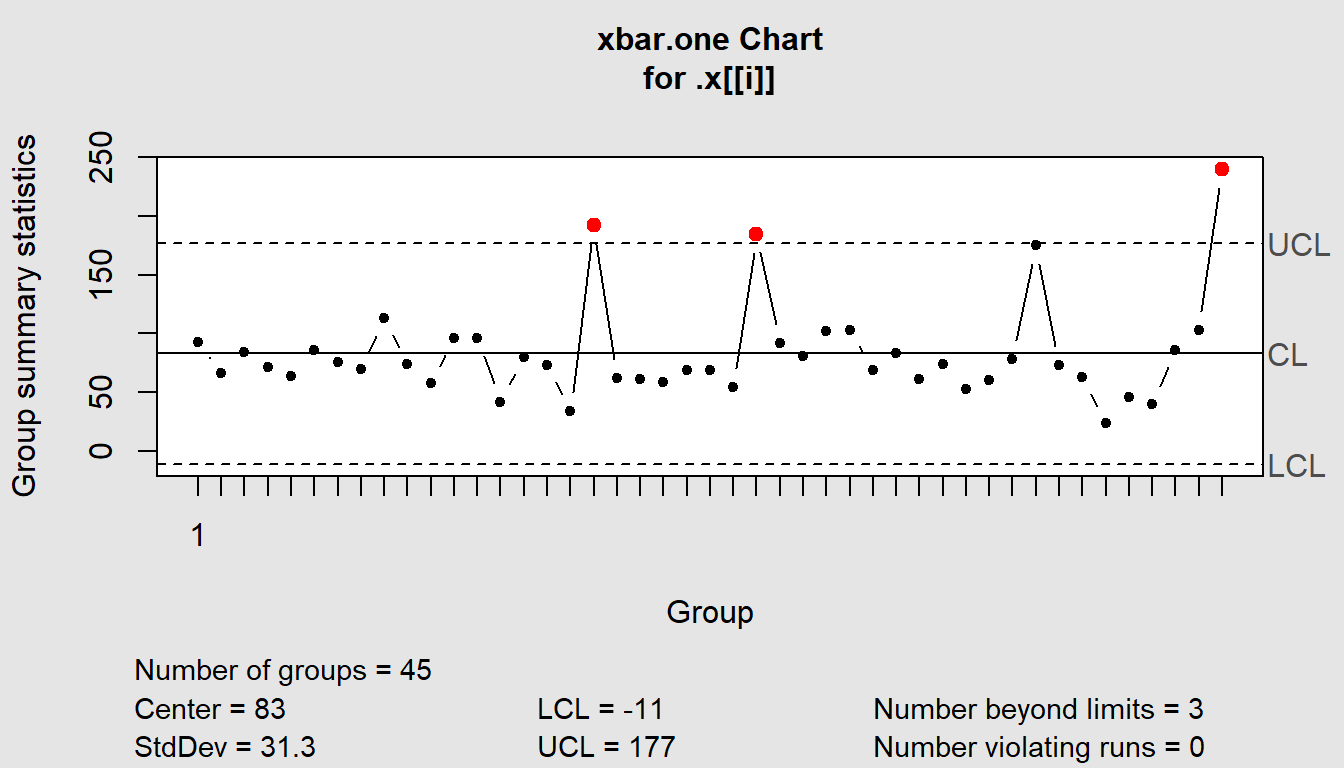
$`Grievance Resolution`
List of 11
$ call : language .f(data = .x[[i]], type = "xbar.one")
$ type : chr "xbar.one"
$ data.name : chr ".x[[i]]"
$ data : num [1, 1:45] 93 66 84 71 64 86 76 70 113 74 ...
..- attr(*, "dimnames")=List of 2
$ statistics: Named num [1:45] 93 66 84 71 64 86 76 70 113 74 ...
..- attr(*, "names")= chr [1:45] "1" NA NA NA ...
$ sizes : int 45
$ center : num 83
$ std.dev : num 31.3
$ nsigmas : num 3
$ limits : num [1, 1:2] -11 177
..- attr(*, "dimnames")=List of 2
$ violations:List of 2
- attr(*, "class")= chr "qcc"
$`HR Report`
List of 11
$ call : language .f(data = .x[[i]], type = "xbar.one")
$ type : chr "xbar.one"
$ data.name : chr ".x[[i]]"
$ data : num [1, 1:441] 400 205 0 14 0 ...
..- attr(*, "dimnames")=List of 2
$ statistics: Named num [1:441] 400 205 0 14 0 ...
..- attr(*, "names")= chr [1:441] "1" NA NA NA ...
$ sizes : int 441
$ center : num 28.6
$ std.dev : num 40.5
$ nsigmas : num 3
$ limits : num [1, 1:2] -92.8 150
..- attr(*, "dimnames")=List of 2
$ violations:List of 2
- attr(*, "class")= chr "qcc"
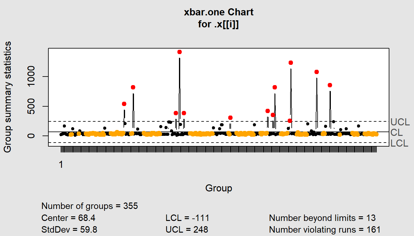
$`Job Classification`
List of 11
$ call : language .f(data = .x[[i]], type = "xbar.one")
$ type : chr "xbar.one"
$ data.name : chr ".x[[i]]"
$ data : num [1, 1:355] 22 30 43 40 166 ...
..- attr(*, "dimnames")=List of 2
$ statistics: Named num [1:355] 22 30 43 40 166 ...
..- attr(*, "names")= chr [1:355] "1" NA NA NA ...
$ sizes : int 355
$ center : num 68.4
$ std.dev : num 59.8
$ nsigmas : num 3
$ limits : num [1, 1:2] -111 248
..- attr(*, "dimnames")=List of 2
$ violations:List of 2
- attr(*, "class")= chr "qcc"
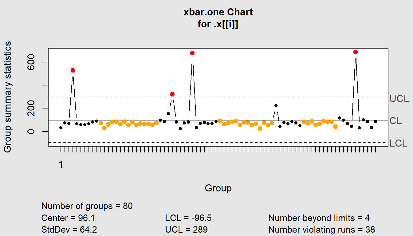
$Recruitment
List of 11
$ call : language .f(data = .x[[i]], type = "xbar.one")
$ type : chr "xbar.one"
$ data.name : chr ".x[[i]]"
$ data : num [1, 1:80] 31 73 69 526 64 ...
..- attr(*, "dimnames")=List of 2
$ statistics: Named num [1:80] 31 73 69 526 64 ...
..- attr(*, "names")= chr [1:80] "1" NA NA NA ...
$ sizes : int 80
$ center : num 96.1
$ std.dev : num 64.2
$ nsigmas : num 3
$ limits : num [1, 1:2] -96.5 288.7
..- attr(*, "dimnames")=List of 2
$ violations:List of 2
- attr(*, "class")= chr "qcc"
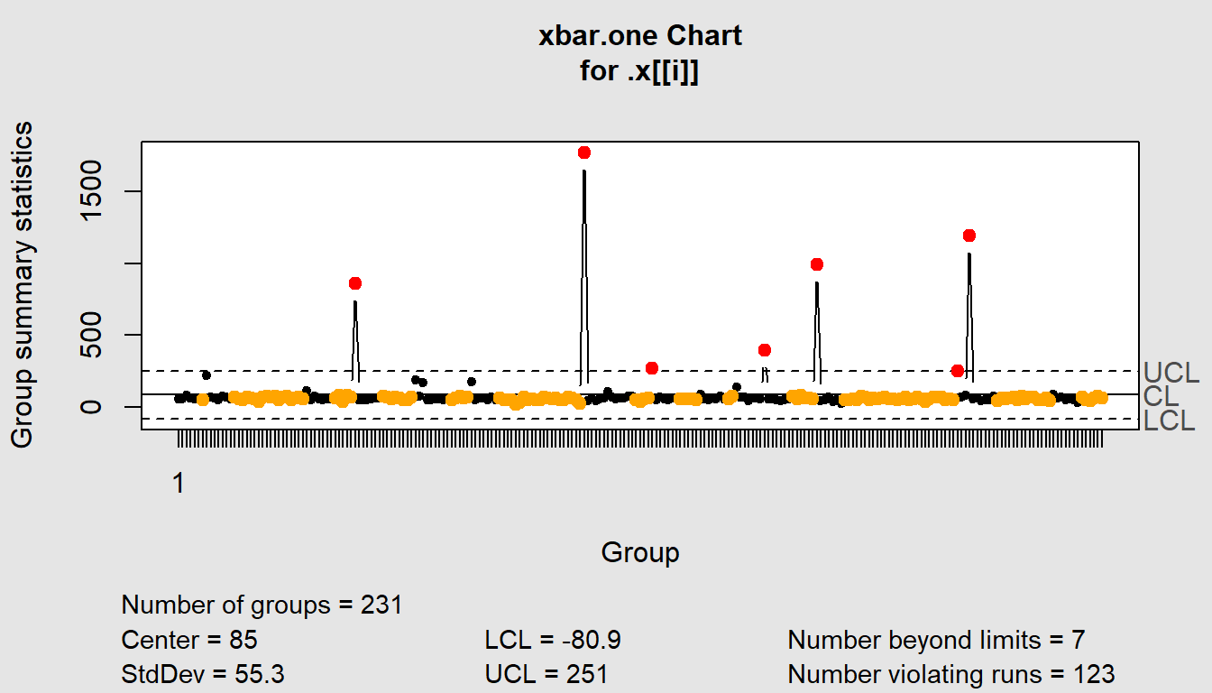
$`Training Delivery`
List of 11
$ call : language .f(data = .x[[i]], type = "xbar.one")
$ type : chr "xbar.one"
$ data.name : chr ".x[[i]]"
$ data : num [1, 1:231] 59 59 82.8 65 57 ...
..- attr(*, "dimnames")=List of 2
$ statistics: Named num [1:231] 59 59 82.8 65 57 ...
..- attr(*, "names")= chr [1:231] "1" NA NA NA ...
$ sizes : int 231
$ center : num 85
$ std.dev : num 55.3
$ nsigmas : num 3
$ limits : num [1, 1:2] -80.9 251
..- attr(*, "dimnames")=List of 2
$ violations:List of 2
- attr(*, "class")= chr "qcc"5 Valuable Service Desk Metrics
Source: https://www.ibm.com/communities/analytics/watson-analytics-blog/it-help-desk/
Number of tickets processed and ticket/service agent ratio –Two simple metrics that add up the number of tickets submitted during specific times (i.e. shift, hour, day, week, etc.) and create a ratio of tickets/available service agents during those times. This is a key KPI that speaks to staffing levels and informs other Service Desk metrics.
Wait times – How long after a customer submits a service request do they have to wait before Service Desk agents start working on the ticket? Your wait time metrics also speak to Service Desk staffing levels. Once you identify whether your Service Desk has excessive wait times, you can drill down to see what might be causing wait times to run long (i.e. low staff levels at certain times of the day or week; not enough service agents trained for a specific service; processing issues; etc.) and create a remedy that applies to your entire Service Desk organization or to an individual IT service.
Transfer analysis (tickets solved on first-touch versus multi-touch tickets) – Number of tickets that are solved by the first agent to handle the ticket (first-touch) versus the number of tickets that are assigned to one or more groups through the ticket’s lifespan. Great for determining which tickets need special attention, particularly those tickets where automation might reduce the amount of ticket passing between technical groups.
Ticket growth over time and backlog – Trending data showing the increase (or decrease) in the number of Service Desk tickets over time. It can help spot unexpected changes in user requests that may indicate a need for more Service Desk staff or more automation. Or, it may identify that a specific change resulted in increased Service Desk resources. You also want to check the trends for your backlog of tickets in progress and the number of unresolved tickets. A growth in backlogged tickets can indicate a change in service desk demand or problems with service deployment.
Top IT services with the most incidents – Spotlights which services are failing, causing the most Service Desk support. Helpful for spotting problem IT services that need modification.
it_helpdesk <- read_csv("https://hranalytics.netlify.com/data/WA_Fn-UseC_-IT-Help-Desk.csv")it_helpdesk %>%
ggplot() +
aes(x=ITOwner) +
geom_bar() +
labs(x="IT Owner",
y="Number of tickets",
title="Tickets by IT Owner") +
theme_minimal()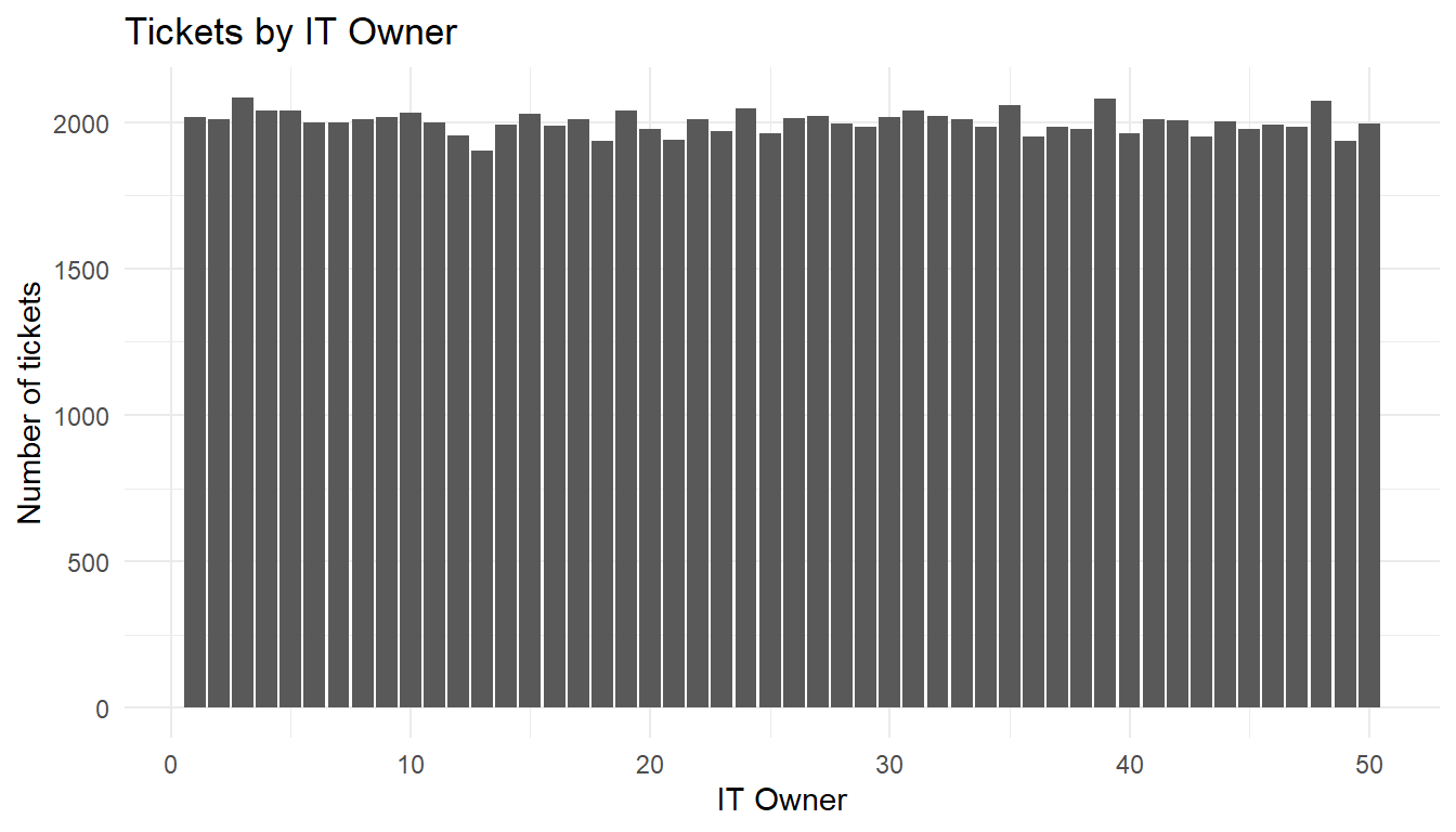
it_helpdesk %>%
  ggplot() +
  aes(x=daysOpen) +
  geom_bar() +
  labs(x="Number of days ticket was open for",
       y="Number of tickets",
       title="Time to resolve/close tickets") +
  theme_minimal()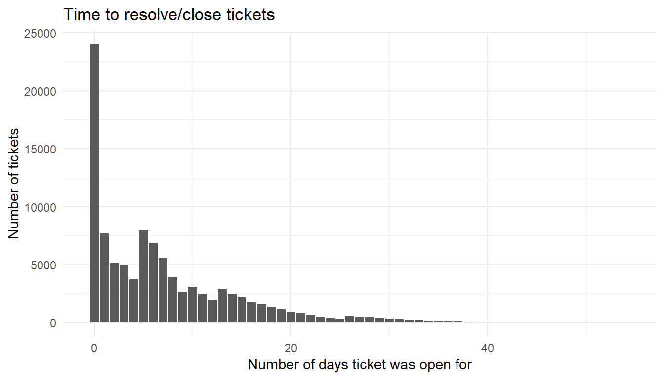
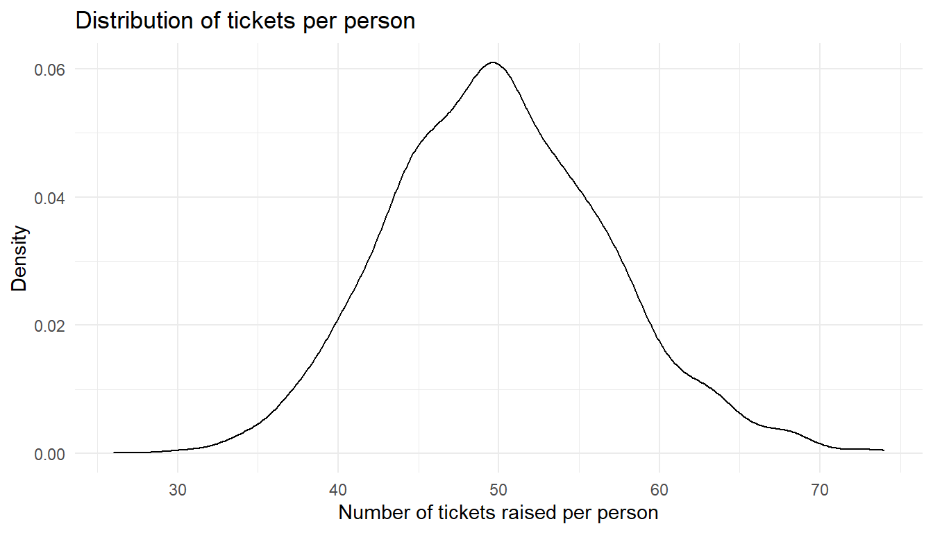
it_helpdesk %>%
  count(Requestor) %>%
  ggplot() +
  aes(x=n) +
  geom_density() +
  labs(x="Number of tickets raised per person",
       y="Density",
       title="Distribution of tickets per person") +
  theme_minimal()